Product managers present constantly: they run research → share findings; a new quarter kicks off → they set goals; a quarter, half-year, or year wraps up → they review results; and so on.
Data visualization is often the weakest part of these presentations, so I decided to put together a Google Sheets template where I’ll collect and update reference chart examples covering the most common product, business, and financial data scenarios.
The spreadsheet includes 5 templates:
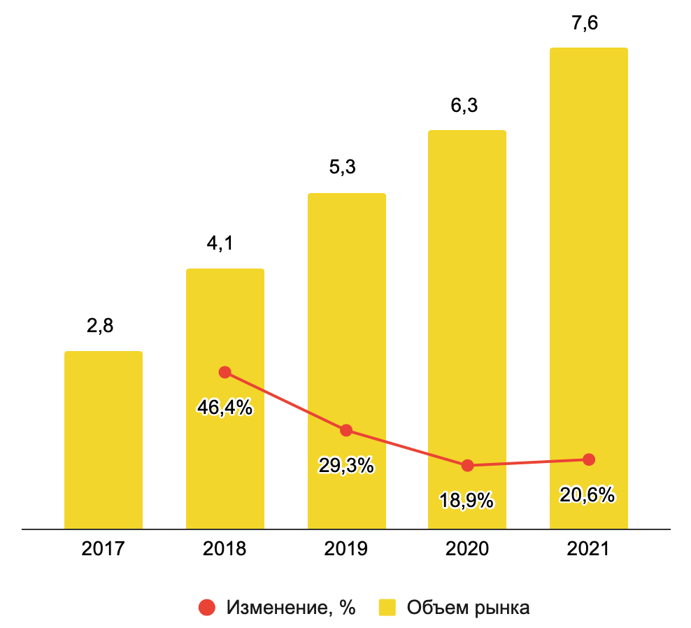
1. Market Size Visualization Chart
A bar chart showing revenue for the past 5 years, combined with a line chart tracking year-over-year growth rates. The simplest and clearest way to visualize market size over time.
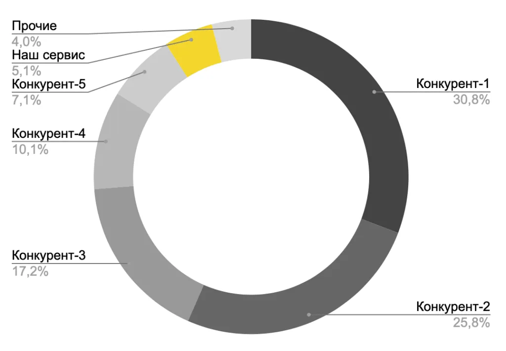
2. Top Competitors Visualization Chart
A donut chart showing each key competitor’s share of revenue.
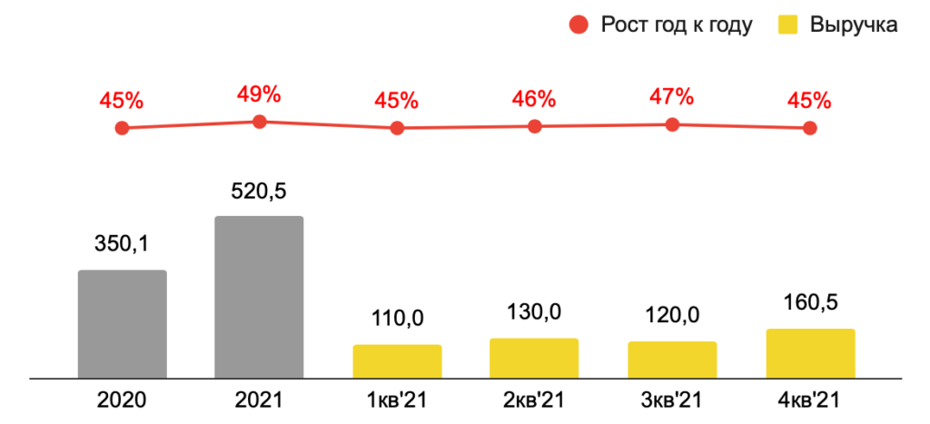
3. Year-over-Year Revenue Growth Chart
A visualization that shows not just annual revenue, but also a quarterly breakdown — plus year-over-year revenue change.
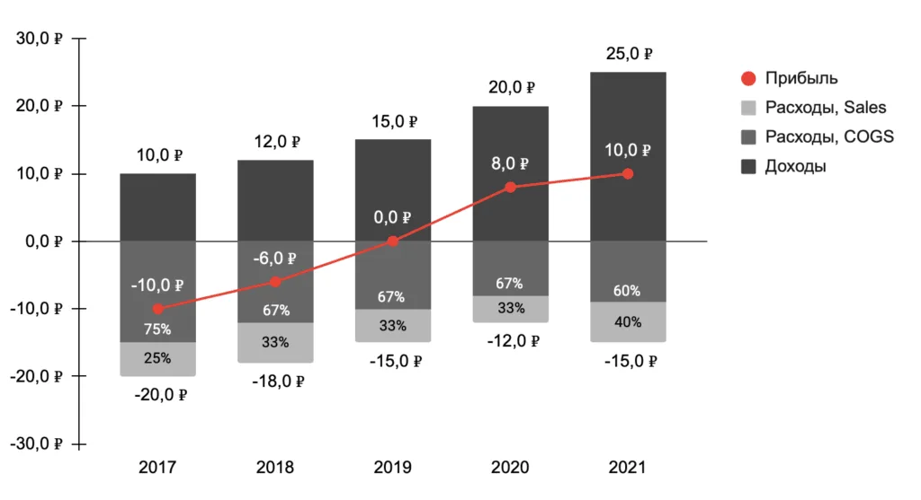
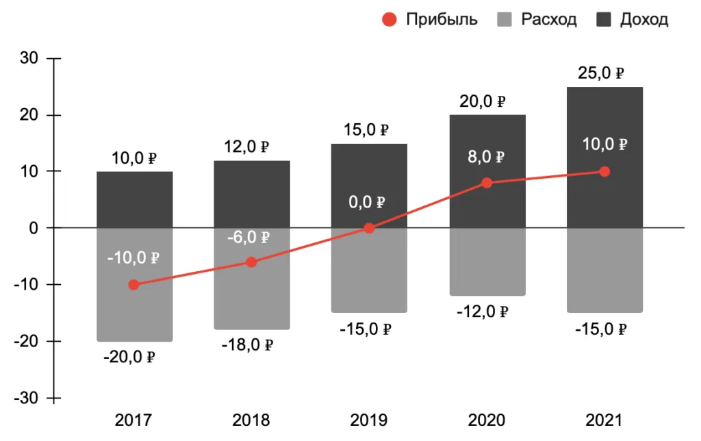
4. Simple P&L Visualization Chart
A combo chart where positive bars represent Revenue and negative bars represent Expenses. A dashed line shows Profit. Clean and easy to read.
5. Detailed P&L Visualization Chart
Unlike the previous template, this one breaks Expenses down by category, showing each category’s share of total expenses. Less immediately readable than the simple version, but more granular.